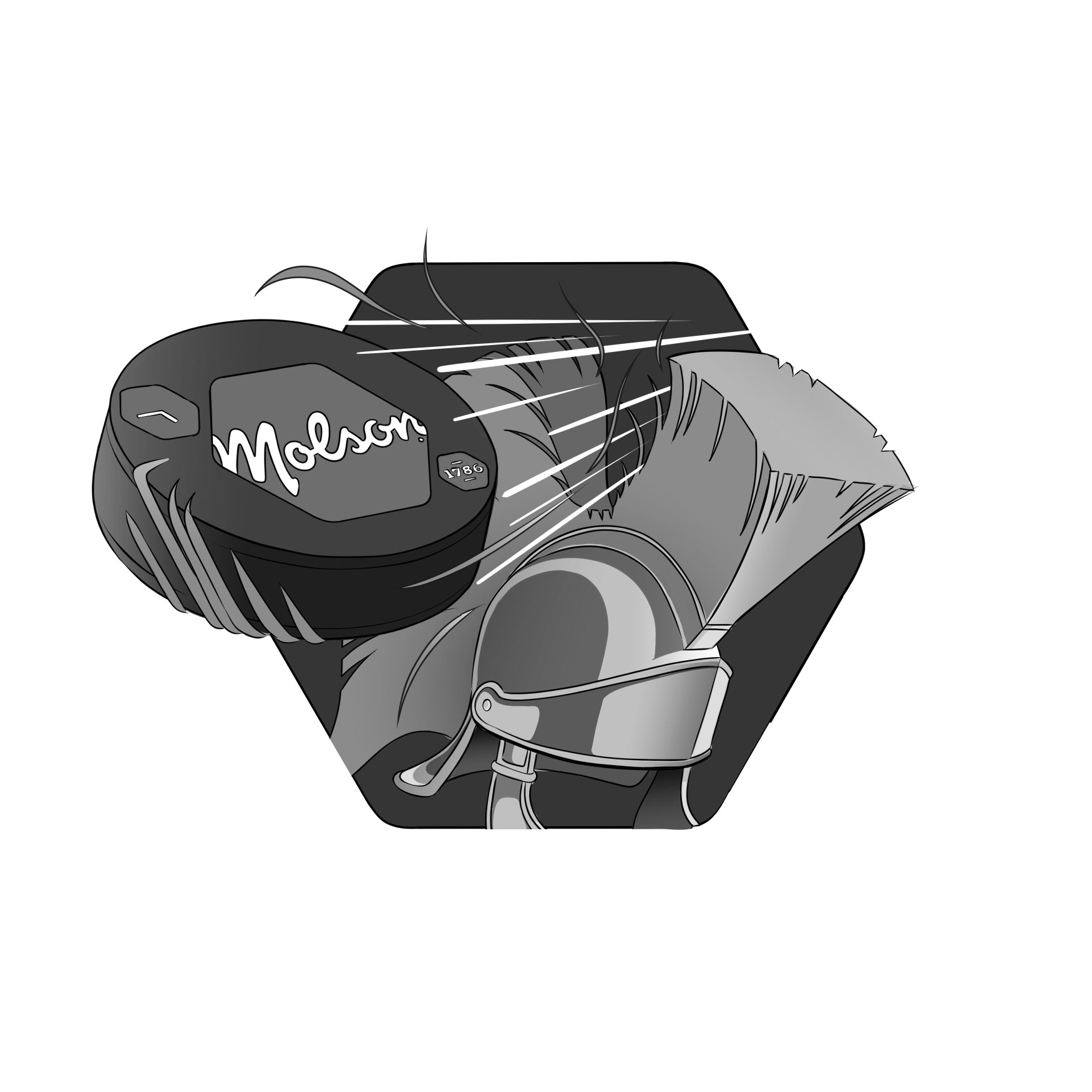
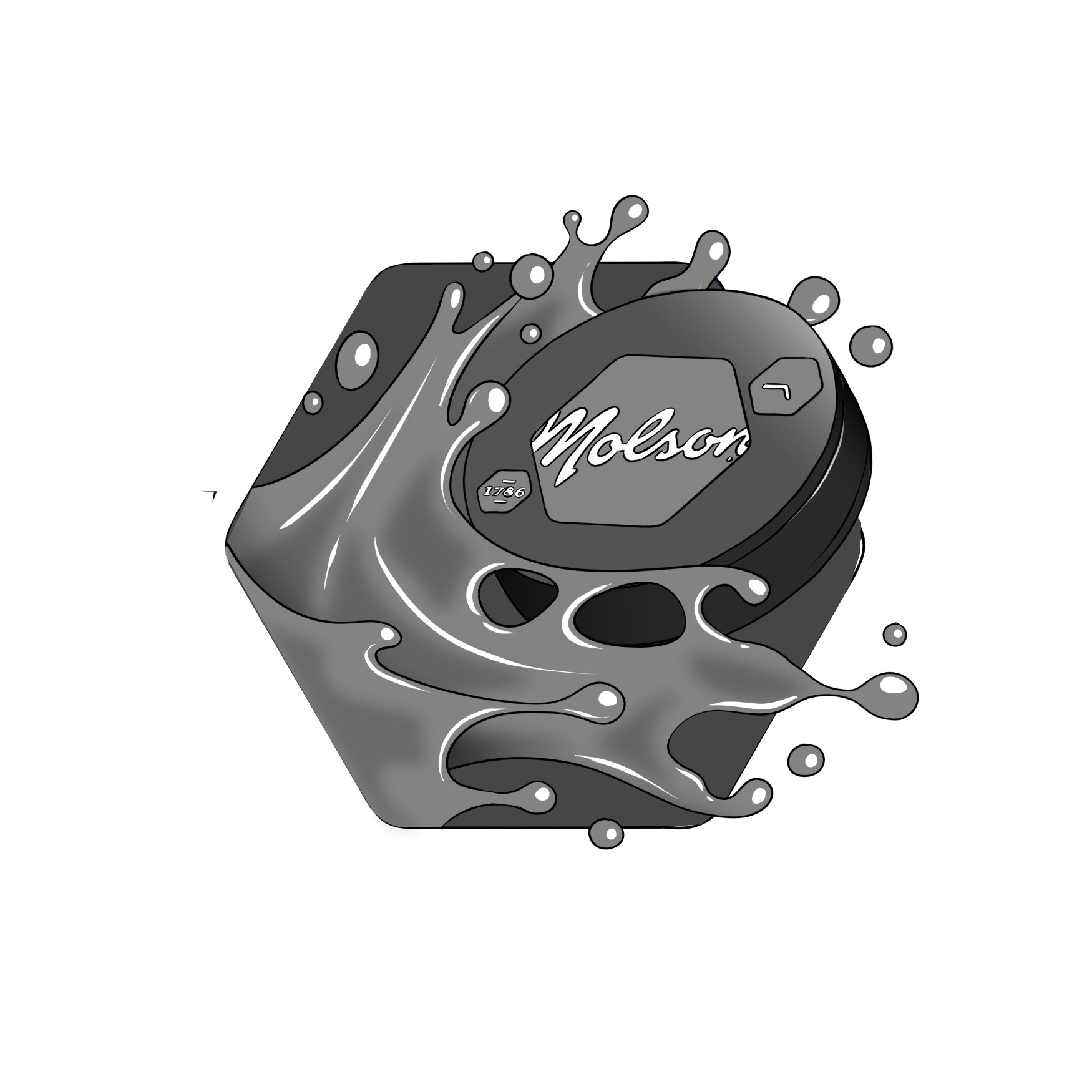
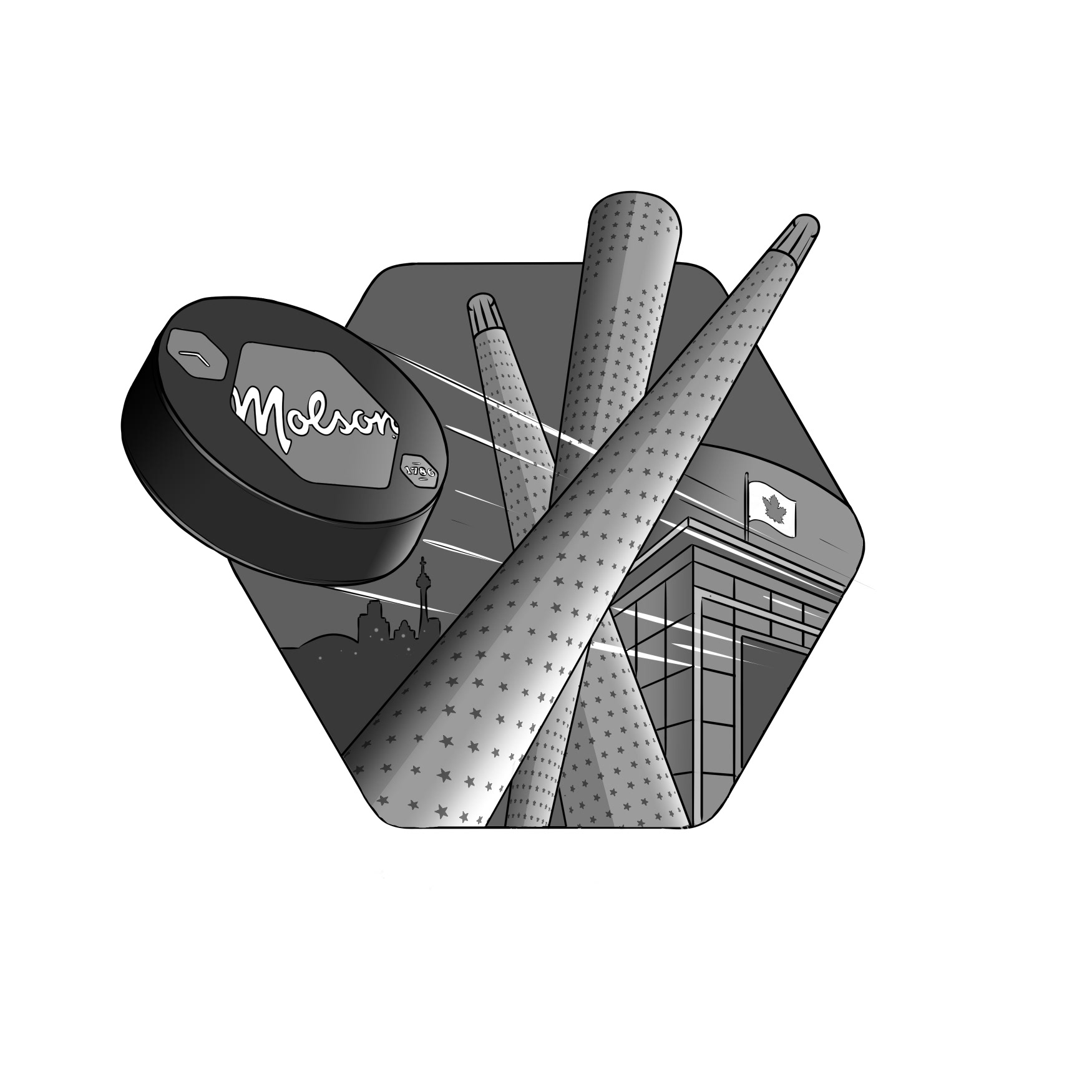
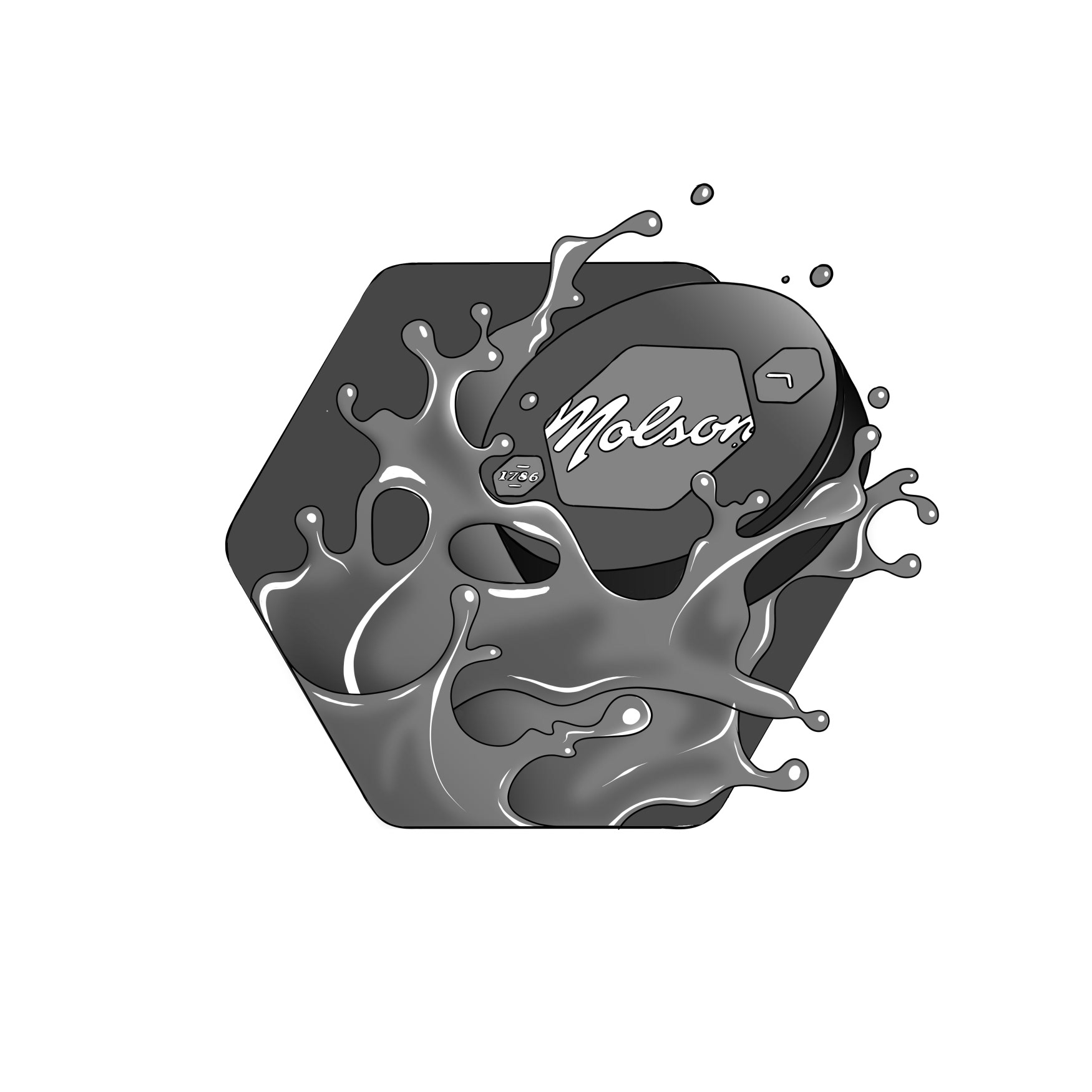
I was commissioned by the excellent team at BrandOpus to create a series of bespoke “Hex” illustrations as part of their rebrand for the iconic Canadian Molson Coors Beverage Company.
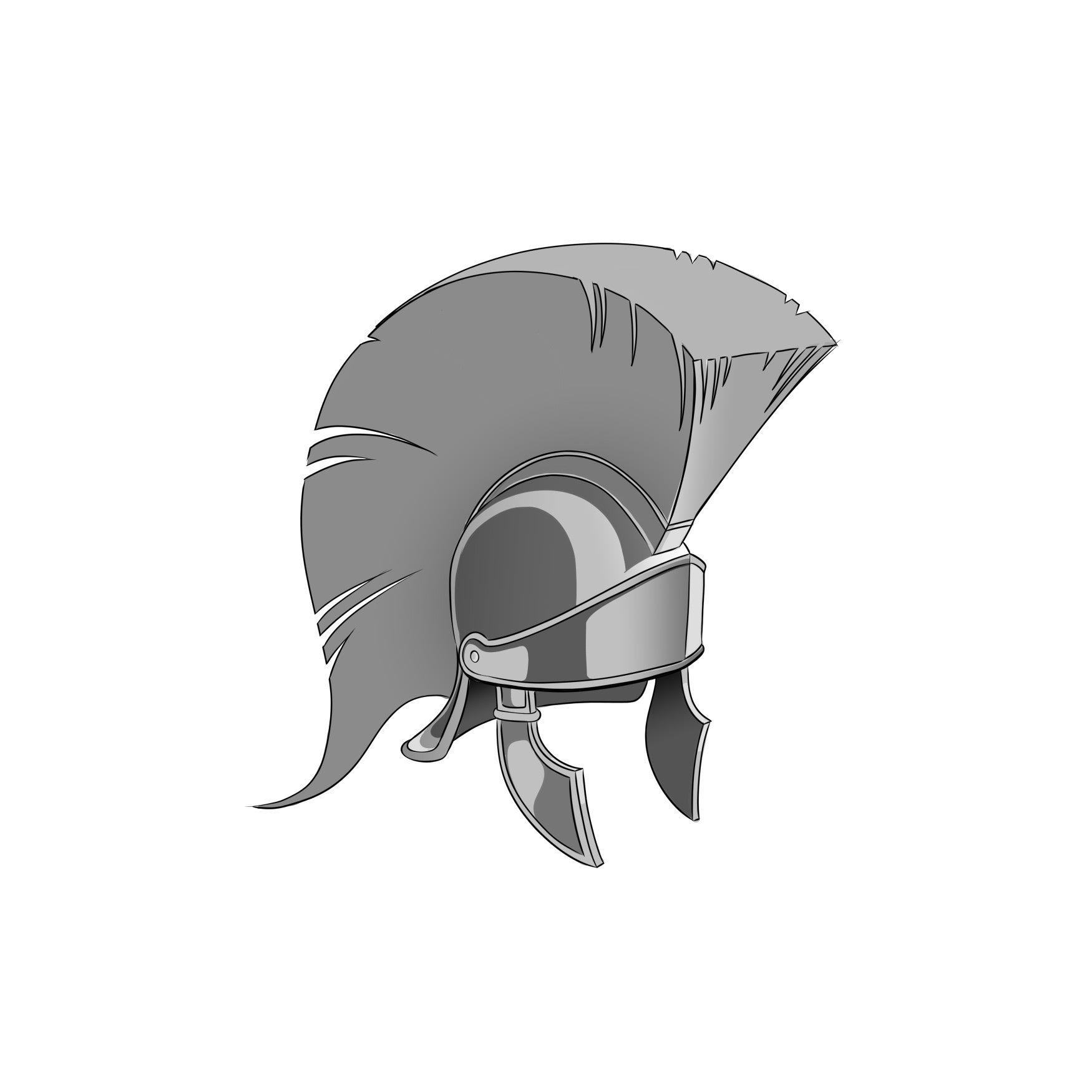
My role in the project was to produce a series of illustrative assets for Molson’s NHL partnership. The goal was to create dynamic, uniquely ownable visuals that represented their partner teams and highlighted the key symbolism of each team and its fan base.
By using Molson’s signature hex shape as the foundation for each composition and incorporating the dynamic branded puck, we aimed to create impactful artwork that places Molson at the very heart of hockey.
Below is a selection of the illustrations, along with context images showing how they were integrated into the innovative Hex brand system designed by the BrandOpus team.
Below is a selection of the illustrations, along with context images showing how they were integrated into the innovative Hex brand system designed by the BrandOpus team.
Sketch Development
